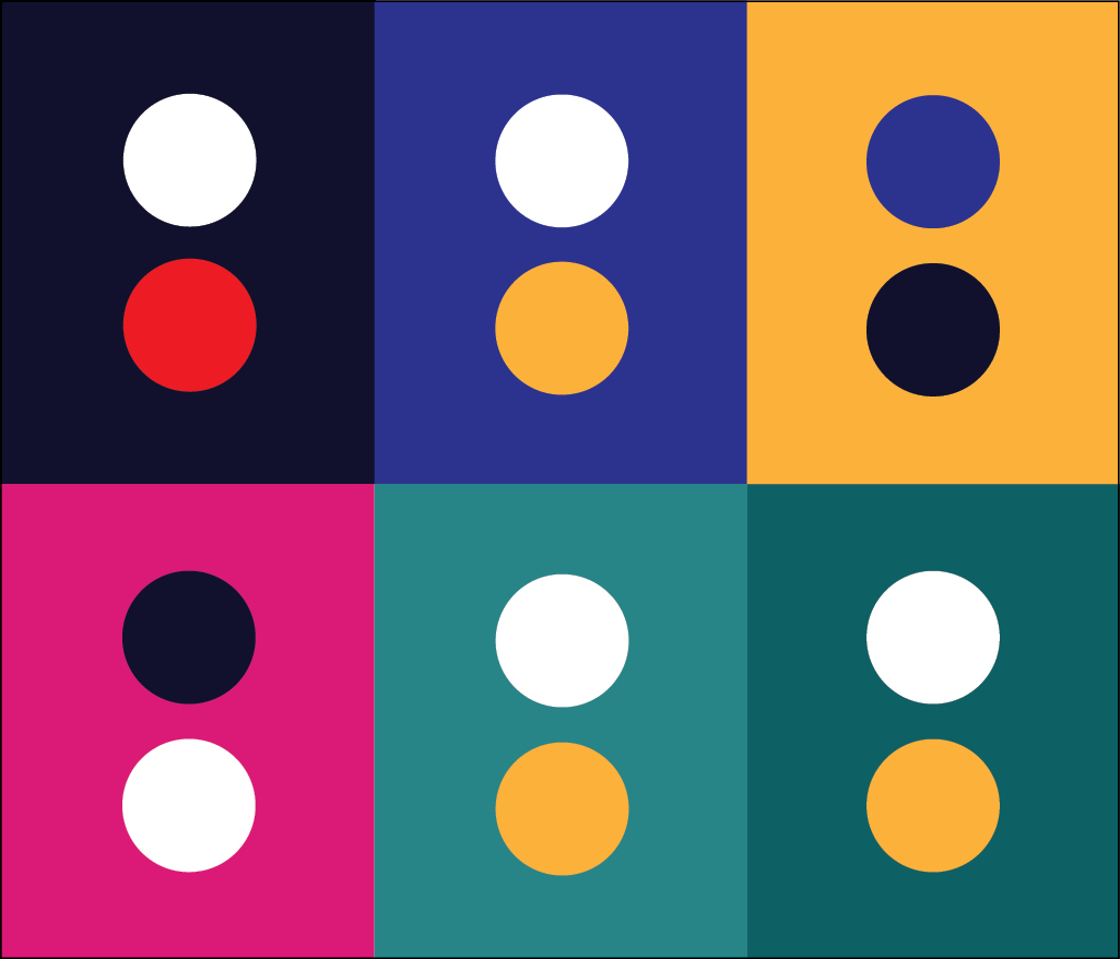
Primary Palette
The primary color palette is made up of the colors associated with fire and EMS — red, blue, gold, and black — representing the firefighting tradition overall.
Secondary Palette
The secondary color palette features more muted tones. These colors may represent the programs, occasions, and holidays that the IAFF highlights. They can also be utilized subtly in graphic applications like social media graphics and posters.
Tertiary Palette
The tertiary color palette features light to lightest shades of the more muted tones derived from the secondary palette. This set of colors and shades aids in the process of designing additional official IAFF materials.
Color Ratios
The ratio of color used in the overall identity should reflect that shown here. The primary palette should be leaned on most heavily, with the secondary palette adding additional support where necessary.

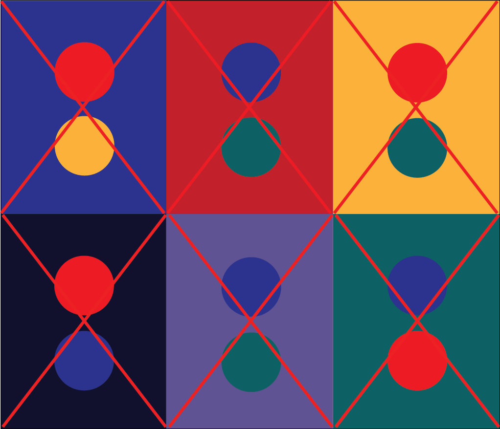
Color Combinations
Not all colors work equally well together. To provide proper contrast, protect legibility, and support accessibility, below are a few color combinations that work well together (left) and those that don't (right). Using these and other high-contrast color pairings creates materials that are readable and effective for all audiences.